
This is an odd thing to write. Anyone who knows me would be quick to point out I am not a design person. In any way, shape or form. I am someone who will complain, at great lengths, about poorly designed things. I may, in fits of desperation, blurt out my thoughts on how to improve something that is terribly designed. Despite this, in my heart of hearts, I am not someone who knows much about or is capable of sharing in an insightful manner about design.
Which is why I have chosen to write about video streaming services and how they are designed. First and foremost a revelation I had of late – I have been lumping all streaming services into the same category. Which is to say that when I think of Netflix I regard them in the same manner as I regard The Criterion Channel, Disney Plus, and Peacock TV. Which is completely wrong.
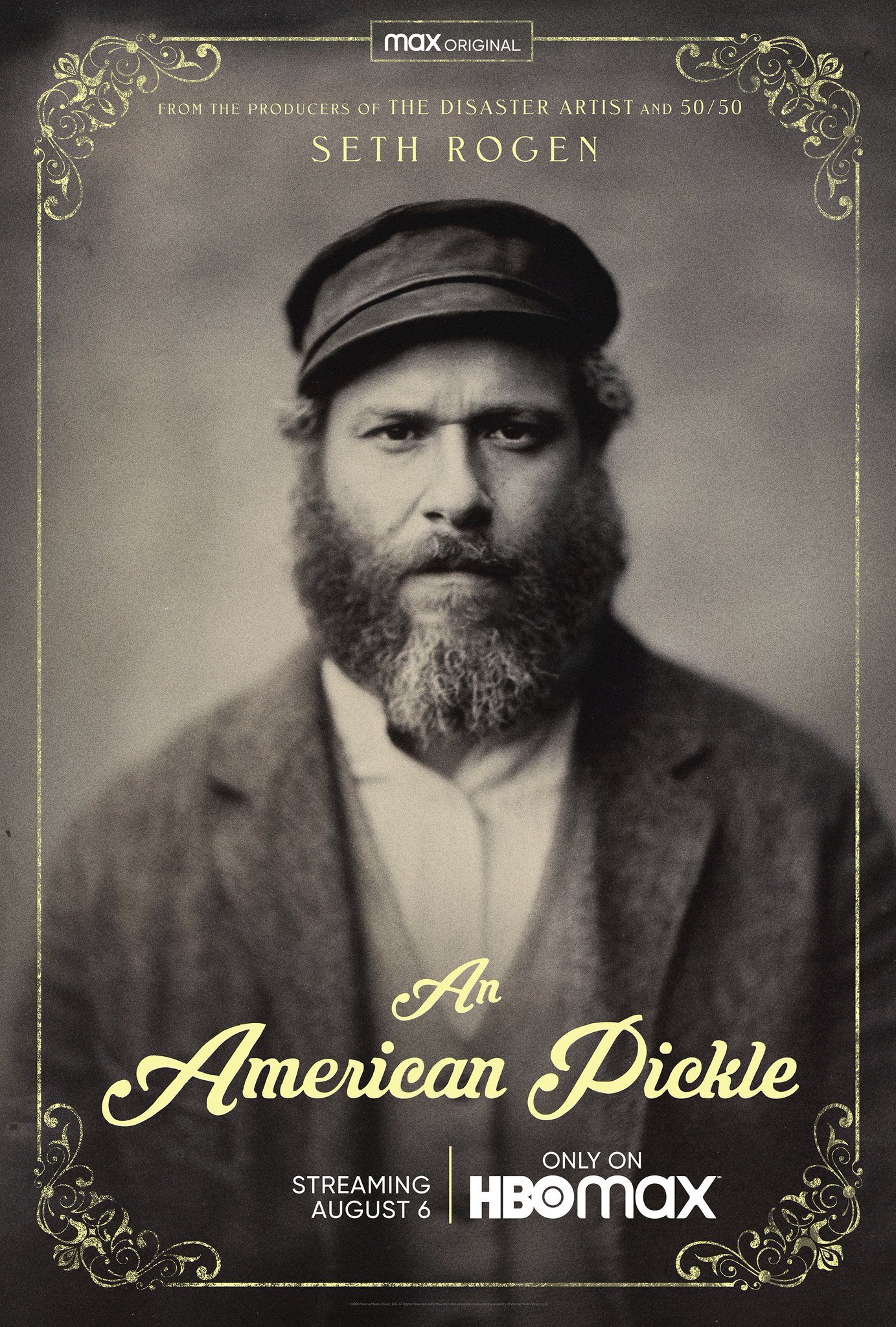
Let us address one streaming service first: HBO Max. My frustration with HBO Max over the past two months has stemmed from me being positively baffled as to 1) why so many shows and films are disappearing from their service and 2) why they have so little new content I want to watch. If you think of HBO Max as being the same kind of entity as Netflix, a streaming service which creates new films and television shows (and apparently games) as well as hosting films and shows they did not make then what HBO Max has been doing is bizarre. Yet if you think of HBO Max as a different iteration of the HBO channel then what they are doing gets downgraded to weird.
For the longest time I have wondered why so many films made by Warner Brothers are not on HBO Max. That is because I assumed, incorrectly, that the good people at HBO would be trying to gather all of their properties (since they are owned by Warner Brothers) to their streaming service. Instead they seem to be following the HBO model of getting new films and shows onto their service for a limited amount of time and expecting subscribers to watch what is offered and be happy about it. The creation of films and shows for their service seems to operate independently of the content available on the site.
I belabor this point because it is easy to mistake HBO Max as being a streaming service like Netflix or Hulu because they do not offer purchases/rentals through their service and because they make original content. Part of this is a design problem and part of this is a streaming service problem. I don’t claim to have the capacity to fix either but today I would like to make an example out of two services in the hope that this might lead to overall changes to streaming services and, potentially, benefit the rest of us.
The two services in question are Mubi and The Criterion Channel.
To begin, since The Criterion Collection has been available to stream I have been using services that allow one to do so. First they were on Netflix, then Hulu then FilmStruck and for the past three years there has been The Criterion Channel. Other than FilmStruck I have used/belonged to these services when The Criterion Collection has been available to stream.
In that time I believe I have watched a handful of films. Part of the reason for the lack of watching is and has been the terrible design displaying their offerings. Netflix has always been lackluster in presenting the movies and shows on their site. Between the ever changing poster images, buried subcategories and the carousel main view, finding what they offer has never been easy. The Criterion Collection had it’s own menu when it was on the site but the offerings were small and changed on a regular basis. I am not sure if I watched anything while Netflix had it.

The same was true with Hulu whose design was only slightly better because at the time they had a Staff Picks section which often showcased excellent films the service offered that were buried deep in their catalogue. Which I believe is why when FilmStruck launched I never subscribed to the service (despite having a subscription to nearly everything else and hearing wonderful things about FilmStruck).
For some reason when I heard that they were launching The Criterion Channel I believed I would love the service. I signed up before it launched, was given this weird thing and have been a subscriber, despite watching almost nothing, ever since.
In some ways it feels a bit like Patton Oswalt’s bit regarding giving money to NPR. You do it because you believe in the work and you appreciate the service but dear God don’t make me listen to it.
But rather then run them down unfairly I would like to provide some evidence to what I would like to call “The Design Problem of The Criterion Channel”.
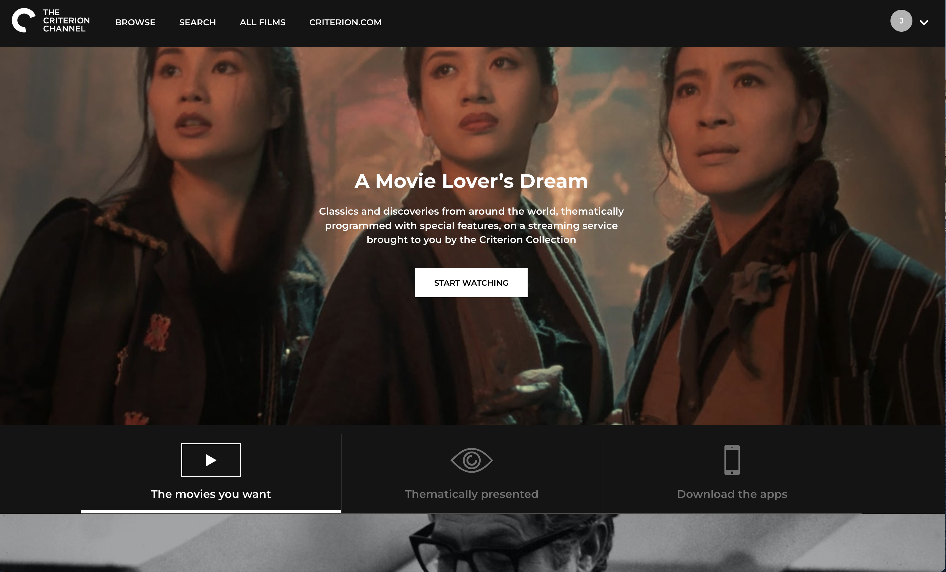
First and I don’t know how to explain it, the design is pretentious. The moment I open the app or go to the site I am bothered by the look and design of everything. The black and white (I see the grey as well) color scheme shouts “We are important!” and makes me want to go elsewhere. At the time of this writing this is the splash page when you visit from your computer.

I’d like to point out that the image itself changes depending on whether or not your browser is full screen. The above image was taken full screen and as you can see only Michelle Yeoh’s eyes are visible. Whereas,
So the site is incorrectly formatted (at least for Firefox and Safari). There are four menus at the top which are unhelpful. You can Browse, Search go to All Films or, bizarrely leave this site to visit Criterion.com. Now as someone who likes language and uses many streaming services (listed in no particular order here: Netflix, Amazon, The Criterion Channel, Mubi, Hulu, Disney+, The Roku Channel, Plex TV, Kanopy, Hoopla, HBO Max, PBS and Apple TV) I cannot say with confidence what the difference between the Search menu and the Browse menu are. Let’s find out.
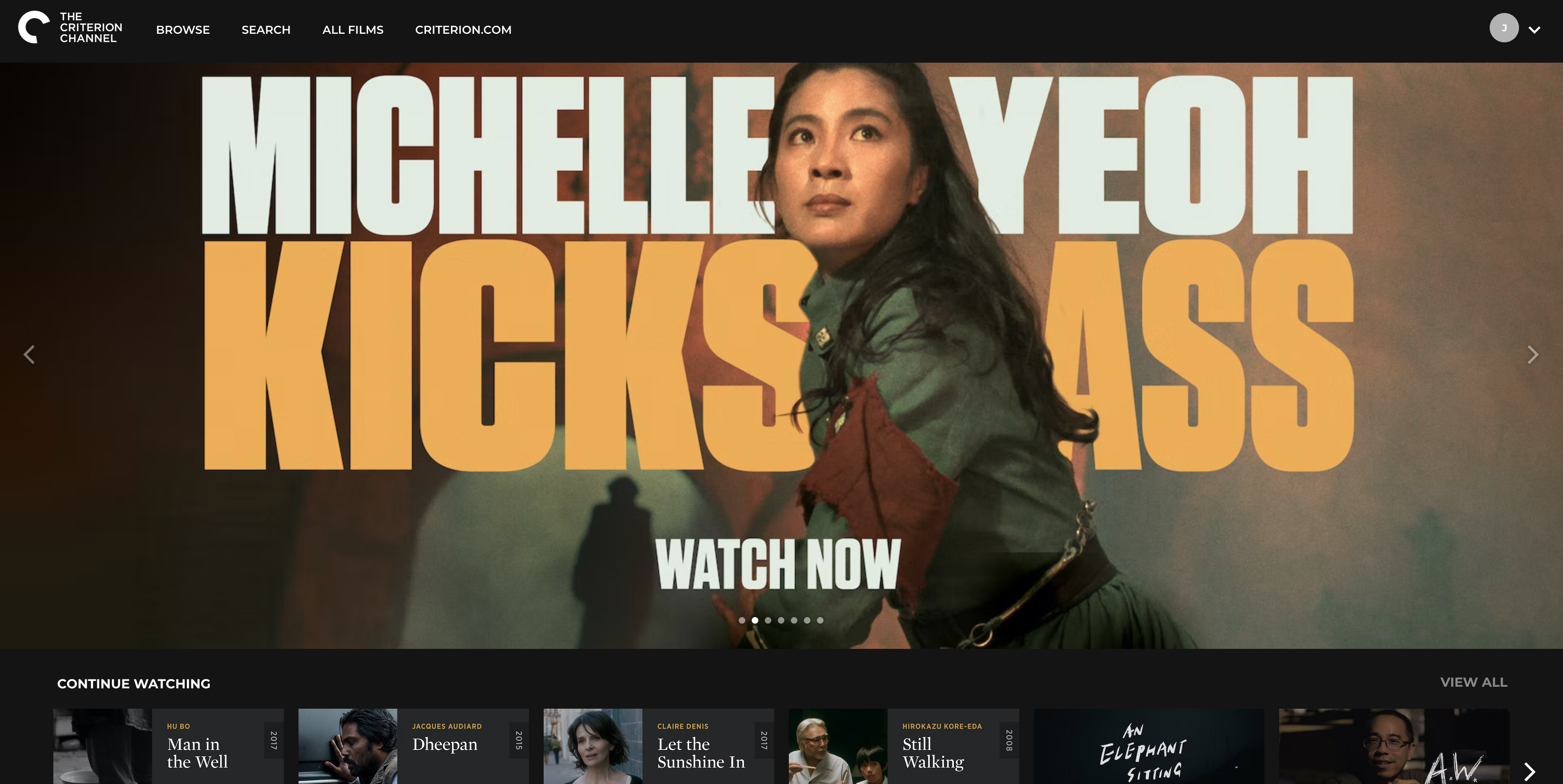
Clicking on Browse takes you to their main page, which resembles the app. Here you have the carousel view of their content with the main large image at the top of the screen. As of today it looks like this –
This is a screen recording of what it is like to scroll down through this page (recorded last month when I started writing this, be kind to me) –
I don’t share this for the sake of overkill, if I am going to criticize I’d like to be fair and thorough. This is a ton of information. They have so much on this site and it is organized in many different ways. The problem, I find, is that there is too much. I find that when I want to watch something I need to already know what I want before I get to the site, otherwise I end up scrolling, clicking and looking for an hour. At which point I’ve either run out of time to watch something or I no longer have a sense of what I’d like to watch.
It is also interesting to note that the header, with the menu options, does not follow you as you scroll through their offerings. Meaning if you decided you’d rather search than browse, you have to scroll back to the top to do so. It’s not a big deal but it’s poor design.
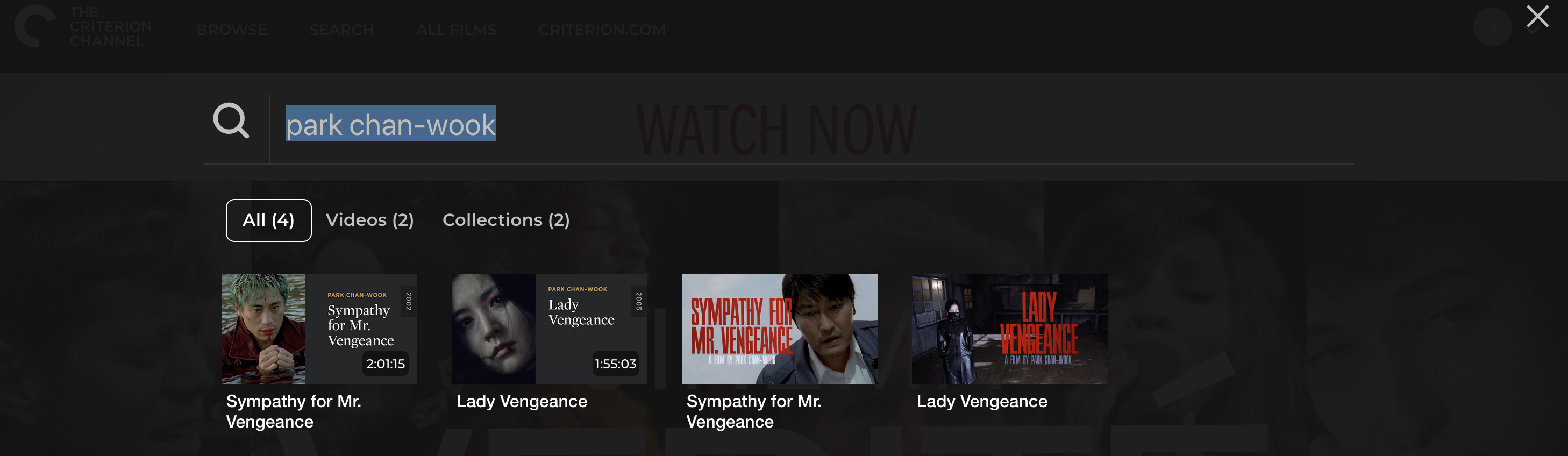
Clicking on the Search menu brings up a search bar. Using this leads to interesting results. This morning I was curious which films they had from the director Park Chan-wook. When I searched using the app on my television I had quite a few results, many having nothing directly to do with the director. Searching on the website I get these results –
My final comments regarding this site/app would be the All Films menu. When you click on it you get the following page –

Personally I love this. To be able to sort and filter the entire catalogue in this manner is appealing. Their filter options are great as they allow you to sort by genres, decades, countries and directors. I think those are interesting and unique filtering parameters. The sort option lets you do so by title, director, year and country. Again, I like this, it’s different and allows you to get creative with what you watch. I certainly have bouts where I want to watch films from a particular country or time period. The thing I would note here, which is not a design issue, is the total number of films.
I recognize that what they offer changes on a monthly basis and that there are strange and mysterious reasons as to why certain films can be shown at certain times – but 2,849 is a small selection. Part of my frustration with this site and all streaming services in particular is the limited selection of films and shows. I’d rather see services merging (or sharing with one another or creating some new entity) in order to have more offerings than this current situation where I have 14 services and often (very often) cannot stream what I wish to because it is not available. Today that happened with I’m a Cyborg But That’s Okay (and yesterday it was Oldboy and so on…).
I am relatively new to Mubi. I joined their service two months ago so I am seeing them with fresh eyes. Why did I join them? Because they had a holiday special of getting three months of service for $1 a month. I could not resist and I am glad I didn’t.
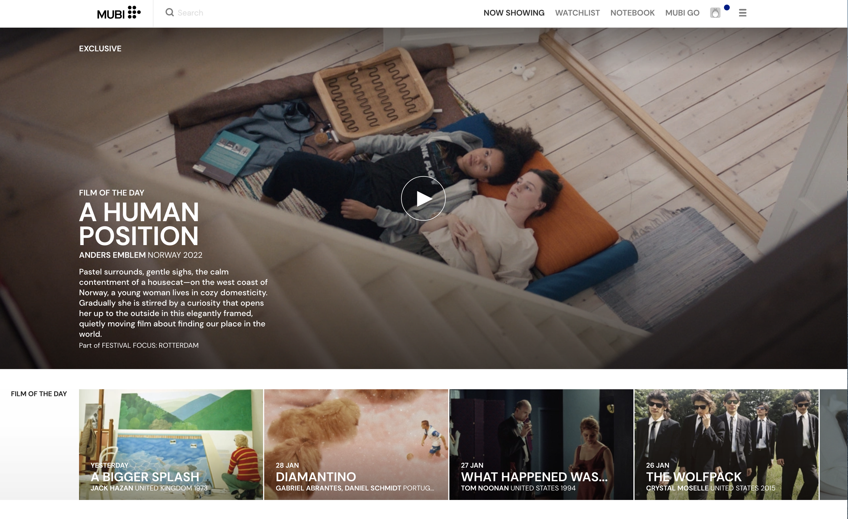
As of this writing this is what the homepage (and app) looks like. First and foremost – look at the color. Look at the titles (and text). Instead of trying to impress me with a splash page telling me the site is a ‘Movie Lover’s Dream’ their main image is of their Film of The Day. I love that feature.
I love that the search bar is built into the top of the screen and they highlight the current tab I am using. The tab next to Now Showing is their Watchlist (List) which is great to have available at the top of the screen. Their version of Criterion.com (minus the selling of DVDs and Blu-rays) is Notebook which has plenty of great written content for those of us who also like to read about film. Mubi Go, which is a separate membership, is their weekly service that allows you to go and see a film in theaters. Your account icon is by default Totoro (points for this) and then a drop down menu with numerous other options.
To say I prefer this design and interface is an understatement. They’ve managed to make it welcoming, packed full of useful (and familiar) features, but also convey that this is a place to watch movies. If you look at the screen recording below you will see that what they do with their site is similar to The Criterion Channel (many different categories, the carousel display). To me, because of how it is designed and interacts with the mouse, I find it helpful and not overwhelming.
When I scroll over a film that is already in my Watchlist is shows a check mark to convey this information. Titles that will be leaving the site soon have a banner on their image which informs me of this. Comparing the two main pages what I see is that Mubi has considerably larger images, which I find pleasing and appropriate for a film site. I would like to note that their header also does not follow when you scroll which is disappointing. As you can see from the screen recording the site goes on for a ways and having the header follow you would be a welcome feature.
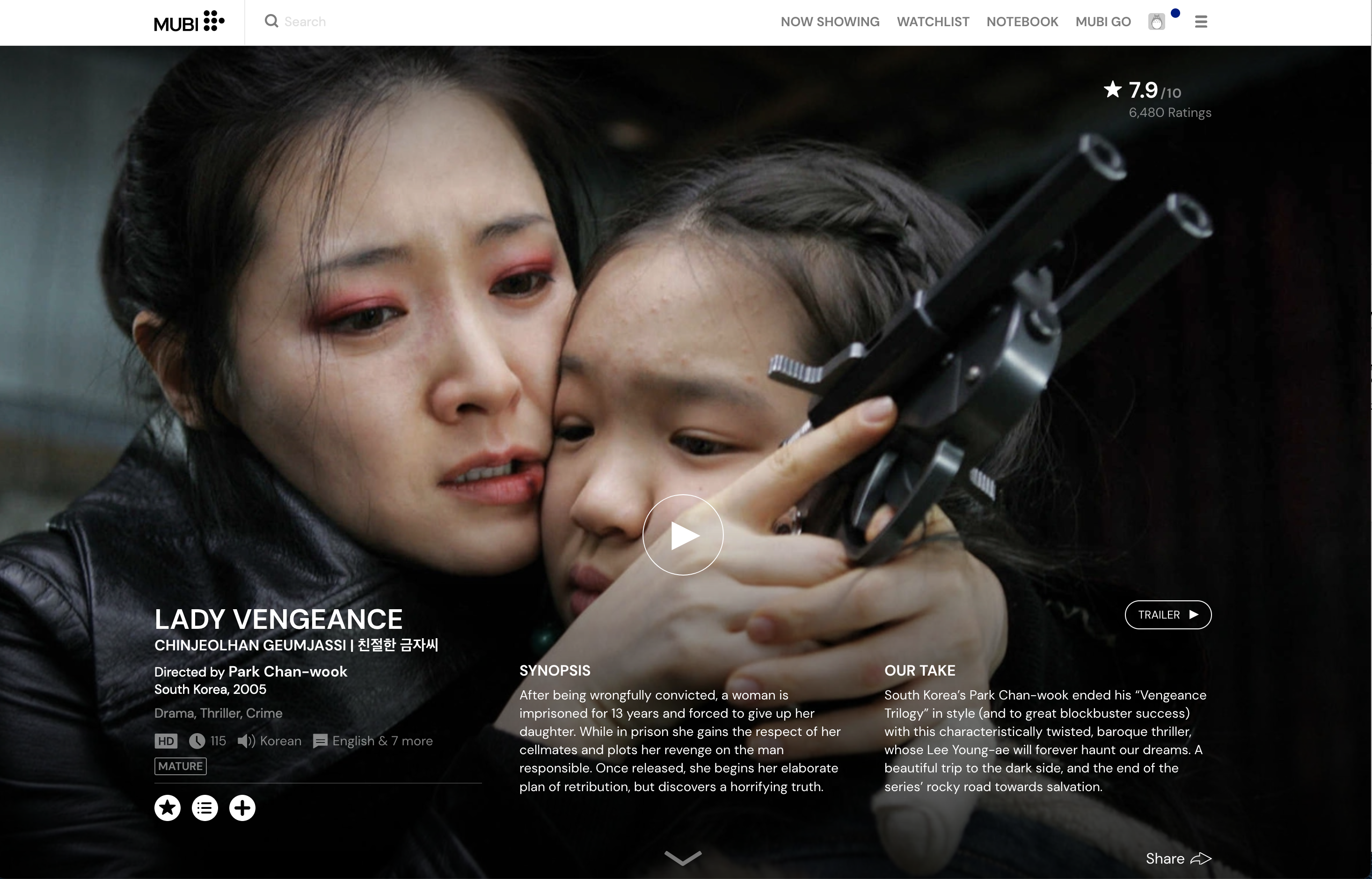
I’d like to conclude with a comparison of how the two services handle the presentation of the same film. I give you: Lady Vengeance.
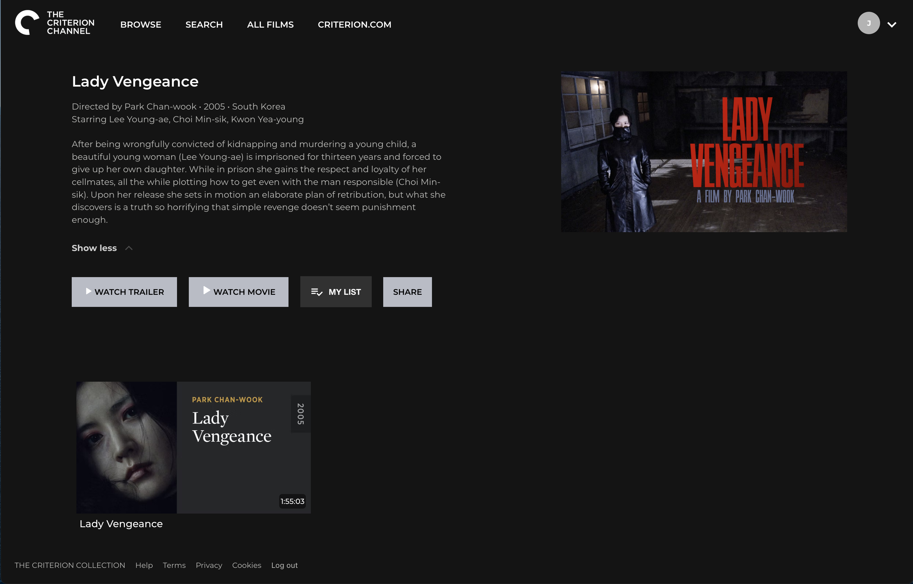
Right away I feel my point is made. The Criterion Channel has so much unused, negative space. The entire right bottom corner is empty. The Criterion Channel has a poster for the film and then their own little display they do for films. This feels unnecessary and redundant. My eye is drawn to the grey bars in the middle of the screen which are the least important pieces of information being displayed.
When you look at Mubi, the image dominates the page. The faces are clearly seen and yet all of the information concerning the film is there and easy to read. The screen has the playhead in the middle to indicate how easily you can watch the film but it is small and tasteful, not obscuring the image.
Among the things I think Mubi does better (or I appreciate) – they offer the title of the film in its original language. Both sites are in English because that’s what I speak, but this feels respectful. I also like that in addition to the synopsis they have the “Our Take” for films. I have found that I no longer bother reading the synopsis because I want to hear what this person has to say about this film. This is the personal, human touch I long for when it comes to film recommendations.
I’ve done a final screen recording to try and convey the differences.
As you can see with The Criterion Channel the image I captured is all of the information they provide for the film. For many films they have supplemental videos that they include at the bottom of the page. The Criterion channel has an astounding number of “extras” for their films but due to how the site is designed you may miss many of them without knowing. I have had two versions of the same film in My List not realizing that one link is for the movie and the other is for their collection concerning the film. This would be easy to fix from a design perspective and helpful to users.
With Mubi they show you the collections the film belongs to, the awards the film has won and director and cast pictures which you can click on to see more information about. They embed the trailer on the page (despite having a link to it above) they have articles from their Notebook section and reviews about the film on the page that you can read in their entirety. After which they have reviews from other people who subscribe to Mubi and they conclude with Related Films.
I find this so pleasing and helpful and vastly superior to how The Criterion Channel has designed their site. It feels unfair to make comments about their offerings because I know they have just as many as Mubi. Unfortunately they have not showcased them in a user-friendly manner like Mubi and I think this is why I use their site so little.
Thank you for joining me on this strange deep-dive into the websites of Mubi and The Criterion Channel. I’m not entirely sure how this happened but I am glad it did.


Leave a comment